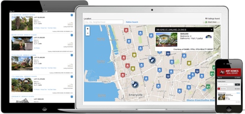
Clients using Optima IDX for custom websites can now provide a fully responsive IDX website that will adapt to any device and screen size. With this update to Optima IDX, all iHomefinder products are now fully responsive. View the press release >>
Explore the New Features
- Responsive design – A single, user-friendly design works on any device or screen size, eliminating the need for a separate mobile website.
- Large, retina-quality photos on details pages (where available).
- Larger photos on search results pages.
- New, improved search user interface.
- Auto-suggest text search on available advanced search fields.
- Widgets – Quick Search with 3 layouts, Address Search, Listing ID Search, Contact Us, More Info Request (for property details pages).
- Built with Bootstrap – Sleek, fast and more customizable than ever.
See a Live Demo
Check it out on our live demo site >>
Make the Switch to Responsive
If you currently use Optima IDX, our step-by-step guide will assist you or your web developer with switching to the responsive version of Optima IDX.
